Fluid Design
Modern UI components with smooth transitions.
Beautiful React UI that are responsive, supports features like dark mode and a11y with elegant transitions.

Subtitle
Card Title
Lorem ipsum dolor sit amet, consectetur adipiscing elit, sed do eiusmod tempor.
- Components
- Forms
- UI
Looks right' isn't enough.
Many UI libraries and component designs often only focus on the design and bare functionalities. They cover the majority of users' needs. However, some component designs may not suit users who rely on accessibility features like screen reader, high-contrast, and reduce-motion. Fluid Design aims to create components that works for all users.


Dark Mode
Automatically switch light and dark modes based on your operating system preference.
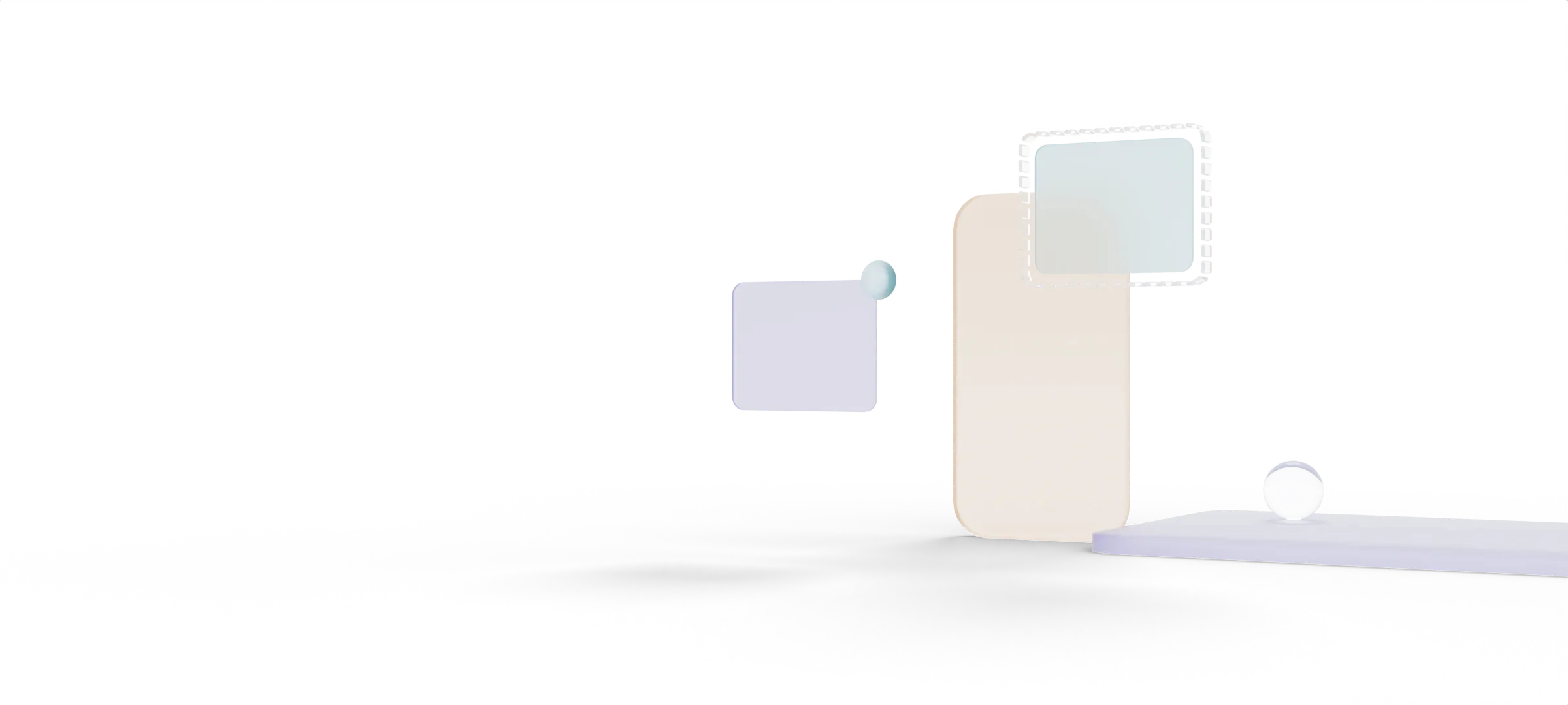
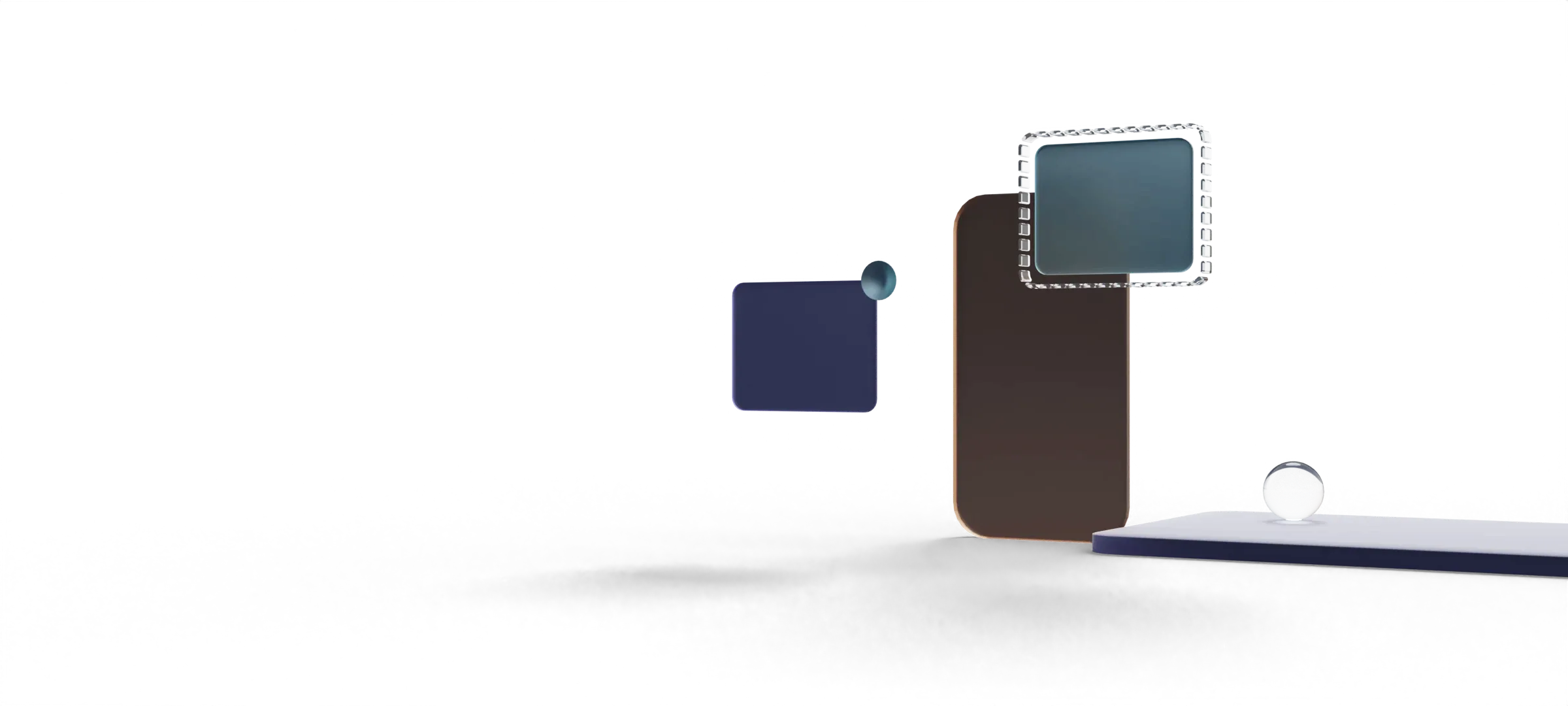
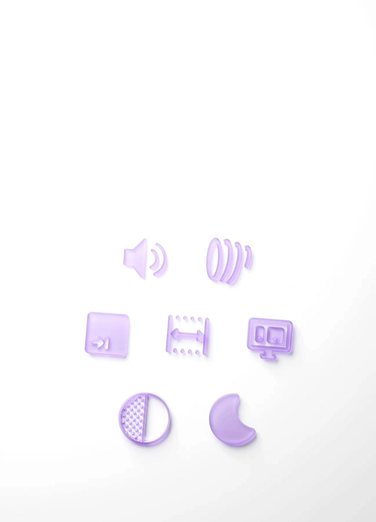
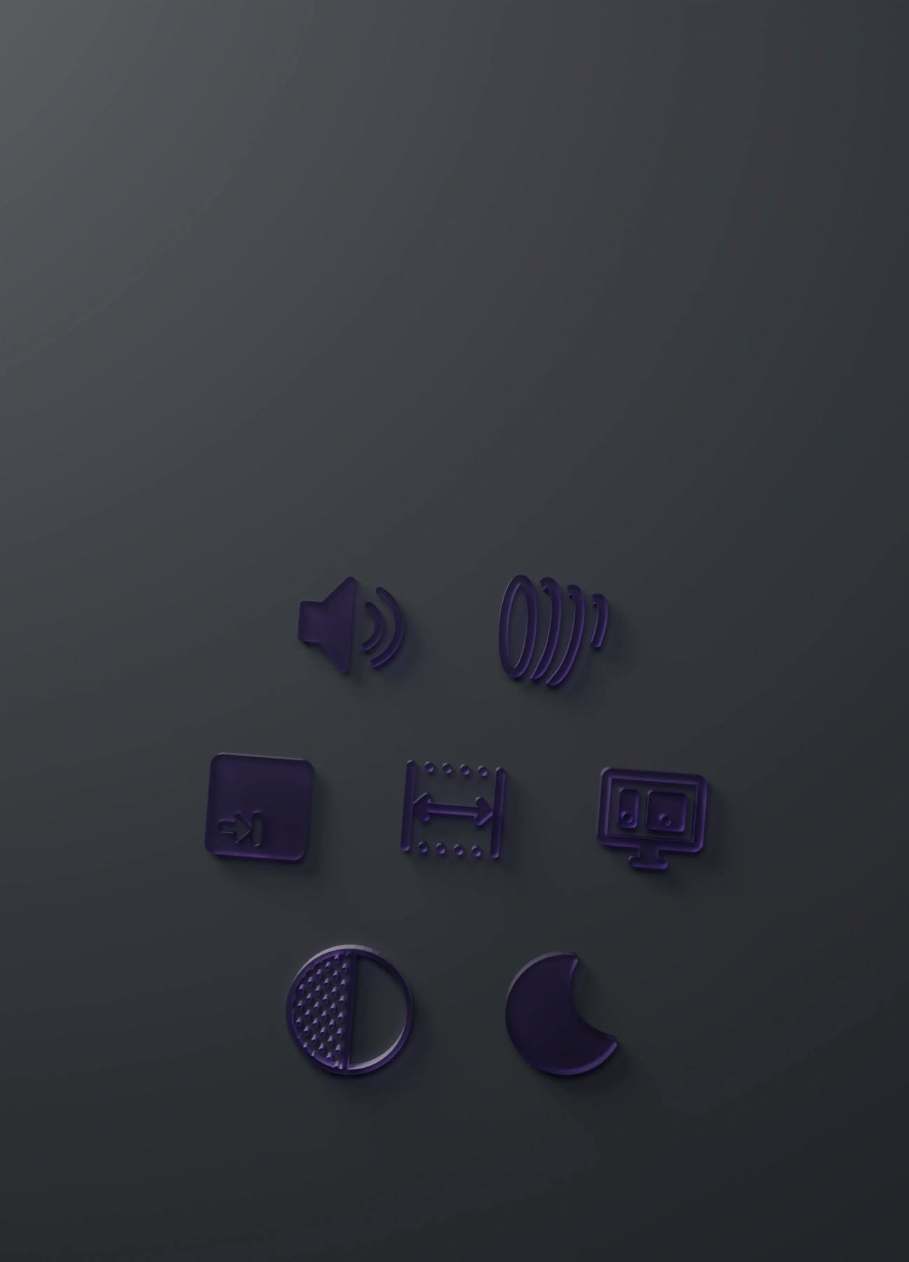
Responsive
Components that work for all screen sizes look elegant on phones, tablets, or desktops.


Multi-platform
Adjust styles based on users' primary pointer, for example, mouse, trackpad, or finger.
Animation
Every component has its own purpose, so its animations and transitions are unique as well.
Keyboard Focus
Clickable elements can be triggered only using keyboard, with beautiful focus highlight.


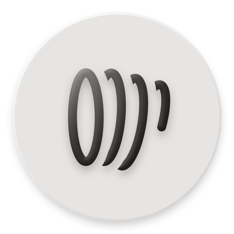
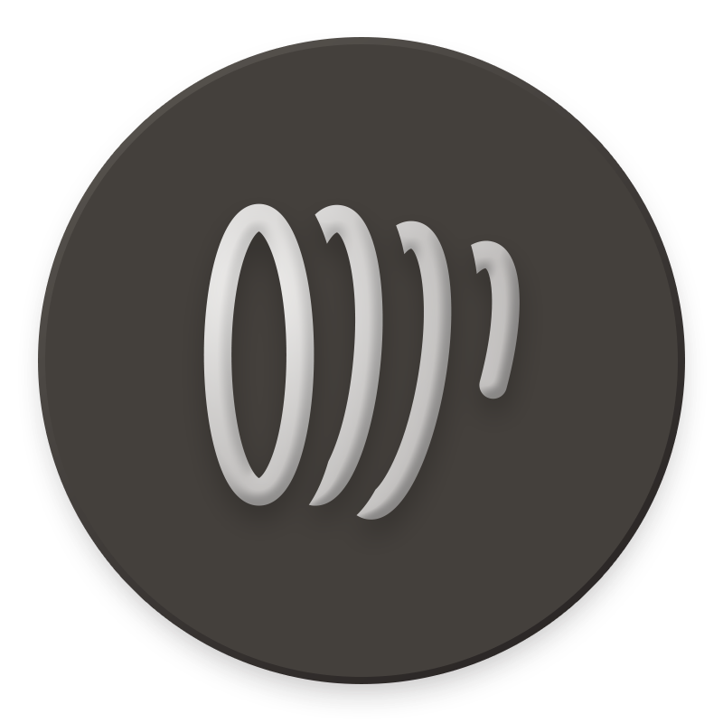
Screen Reader
Optimized for people who have visual disabilities to prompt clear and meaningful descriptions.
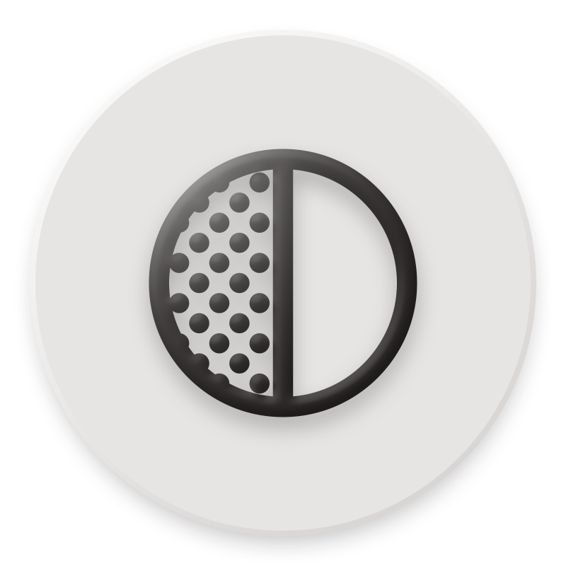
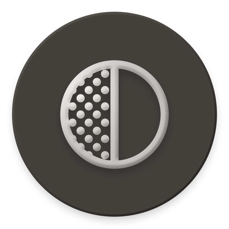
Contrast
Optimized for people who have visual disabilities to make content more differentiable.
Reduce Motion
Animations are awesome, but having a fallback is crucial for users who prefer less motion.
Elegant Design
Many UI libraries and component designs often only focus on the looks. While they cover the majority of users' needs. Fluid Design aims to create components that works for all users, making extra effort to make beautiful design accessible.
Built with a11y in mind.
Utilizing libraries like headlessui to provide a11y features like focus management, keyboard navigation, and screen reader support. Fluid Design also adds support to high-contrast mode, reduce-motion, and light/dark mode.
Simple. But not simplistic.
In order to transform more websites into accessible websites, it is key to make the component intergration process as simple as possible. So anyone can adapt to it, even if they are not familiar with a11y. With no extra effort, you can create a beautiful and accessible website.
The Button component is just one of the many components that are built with a11y in mind.
 <Button
 label='Send'
 color='primary'
 weight='light'
 iconEnd={MDSend}
  />
It all starts with
a simple idea.
The web is a powerful medium for communication and data exchange. However, not every website is created equal for every user. Some websites are difficult to use, and some are inaccessible to users with disabilities. Fluid Design is a set of tools that helps you build websites that are accessible, usable, and user-friendly.
Component
Packed with features
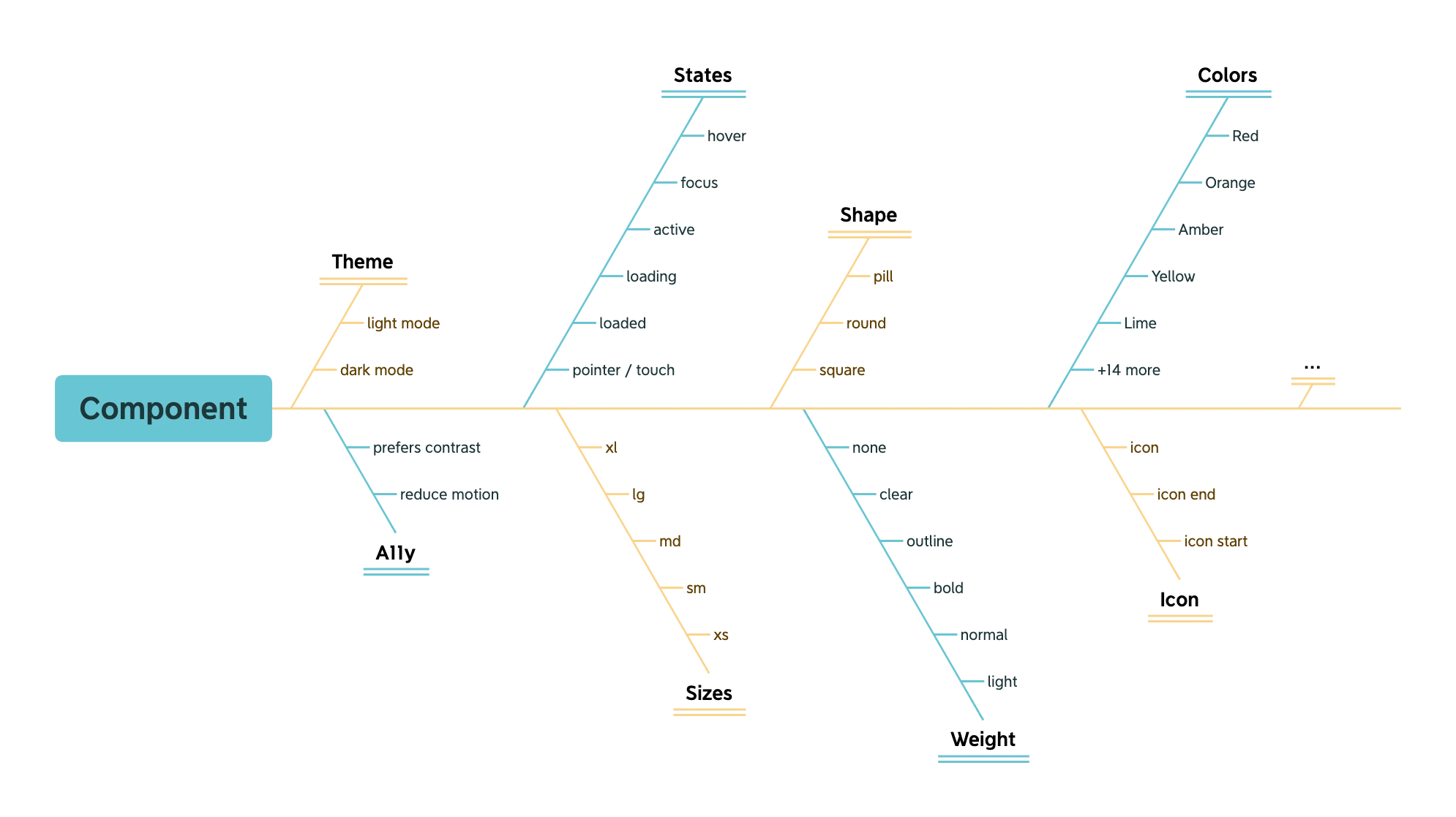
To design a beautiful resuable a11y component, it must be refined not only on the surface, but also under the hood. For example, a component can have states such as hover, focus, and active. It can also have different sizes, colors, weights and corner radius. It can also have disabled, loading, and error states. In addtion, it can have different variants such as outlined, ghost, and link, icons, orientation, cursor or pointer types... All of these needs to have a dark mode version as well. Not to mention the accessibility features that needed to be implemented.
Transitions
Transitions are not just to make the component look pretty. They serves a purpose to help the user understand the state of the component. It also directs the user's attention without needing to add additional context. Fluid Design uses mordern spring animation techniques to create smooth and performant transitions.
Linear
Ease In Out
Spring
import {AccordionTextareaComboboxButtonSwitch} from '...';Effortless intergration
Fluid Design is designed to be used with any React project. The components are made to be as customizable as possible. It handles a11y by default, so you can use the components as is - with little or no required props, or you can customize them, add refs, changing the wrapper type to fit your needs.
Aims to move the web
forward with a11y.
It's an ambitious goal, but it's one that we believe is possible. We believe that by pre-pack all these features and deliver to developers in a simple and easy to use package, we can help move the web forward with a11y.